#10204A
Ocean Lab Arcade
Play has energy.
Play has energy.
Learning has direction.
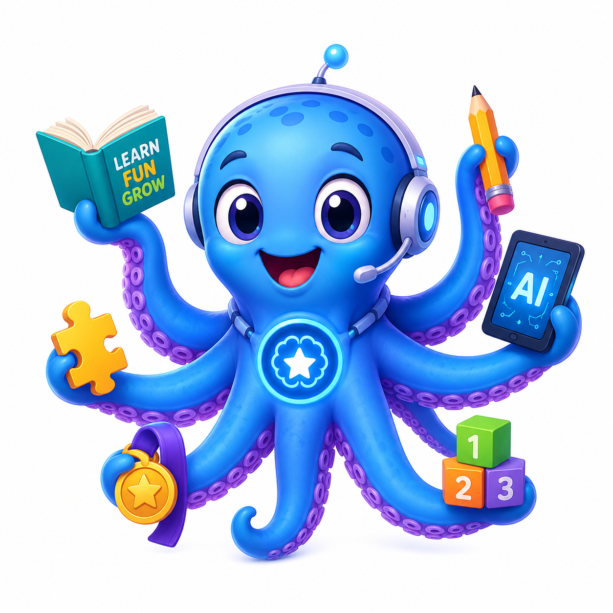
Octimo borrows its palette and movement from the mascot, then applies them with restraint. One expressive learning path carries the brand; everything around it is legible, calm, and specific.
Student: bright and tactile
Admin: quiet and operational
WCAG 2.2 AA target
Colour system
A cool ocean, one warm reward
Blue and ink carry trust and action. Aqua marks focus and energy. Violet belongs to challenge. Mango is reserved for something earned.
#1677E8
#25CBEA
#7048D7
#FFB11B
#F6FAFF
Action and focus
Solid actions use a darker action blue for white-text contrast. Focus combines an Ocean Ink outline with an Aqua halo.
Status is never colour alone
Icons, words, and shape distinguish success, warning, and failure.
Answer saved
Review needed
Access denied
Typography
Friendly headlines, unmistakable letters
Baloo 2 carries the mascot’s roundness in short student-facing moments. Atkinson Hyperlegible keeps questions and instructions easy to parse. Dense admin data uses a restrained utility treatment.
Spot the pattern.
Use for student page titles, milestones, and short mission names—not question stems.
Each number is twice the number before it. Double 24 to find the missing number.
Utility labels stay compact: QUESTION 4 OF 8 · ANSWER SAVED
Interaction kit
Controls say exactly what happens
Primary controls use active verbs. Student controls are tactile and generous; admin controls are more compact without becoming hard to target.
Buttons
Badges and state
In progress
Challenge
+80 XP
Published
Draft
Off
Form fields
Required before content can enter review.
Switches
One brand, two working modes
Student delight; admin precision
The portals share palette, words, and accessible primitives. They do not force the same density, radius, shadow, or information hierarchy.
Your next mission
Find the rule and choose what comes next.
Needs attention
Every count links to the work behind it.
Questions waiting for review18
Import rows with errors2
AI quota warnings0